Figma: view. comment. mirror.
- 4.1
- Rating
- 5.00M
- Installs
- Free
- Price

 Analysis by App-foxy
I use Figma on mobile as a companion to the main design workspace rather than as a complete replacement for a desktop setup. That distinction matters. The app is most useful when I need to check a file, follow a conversation, inspect a prototype, or give a quick response while I am away from my computer. It is less convincing when I try to build a detailed interface from a small screen.
That makes this free Art & Design app an interesting case for trust. A mobile design tool can easily become frustrating if it hides important actions, makes account access confusing, or turns collaboration into a stream of notifications with no clear control. In my experience, Figma’s mobile value comes from keeping the essential parts of a shared design process close at hand while leaving the most demanding editing work to the larger workspace.
Developed by Figma Inc., it has been available since May 8, 2017, and currently sits at version 26.7.0. The Android listing shows a 4.4 average from around 60 thousand ratings, with more than 5 million installs. Those figures do not prove that every workflow will suit you, but they do show that the mobile companion has become a familiar way to reach Figma work away from a desk.
You May Also Like

 Blood Strike: 2.5 Anniversary
Blood Strike’s Loadouts Turn Every Drop Into a Tactical Gamble
A close look at Blood Strike’s custom loadouts: how fast access to signature weapons reshapes its battle royale rhythm, rewards preparation, and narrows the gap between fights.

 Pandora - Music & Podcasts
Pandora’s Music Is Easy to Start, but Harder to Recover
Pandora’s strength is its low-effort path from a seed to a station. Its weak spot is how much confidence it asks you to place in connection, setup, and quiet recovery.

 8 Ball Pool
 Is Built on Rivalries, Rematches, and Routine
A close look at the rivalries, rematches, shared routines, and unanswered safety questions that turn a quick pool match into a persistent mobile community.

 Samsung Music
’s Quiet Strength Is Playing What You Already Own
Its reach comes less from spectacle than from dependable access to a personal library. That simplicity is both the app’s strongest retention engine and its ceiling.

 AccuWeather: Weather Radar
AccuWeather Review: A Quick, Clear Forecast for Everyday Decisions
For everyday plans, the best forecast is the one you can understand quickly. AccuWeather makes rain timing, radar, and local conditions easy to act on, with a few trade-offs.

 Hill Climb Racing
Why Hill Climb Racing Still Turns Crashes Into One More Run
A tiny car, a bumpy hill and one more upgrade: Hill Climb Racing keeps resurfacing because its simple chaos makes every near-miss feel personal.
More From Our News Desk



What the mobile experience is really for
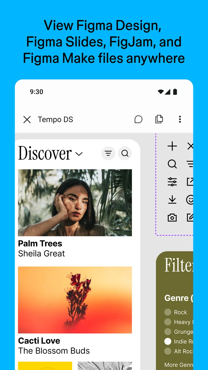
The first thing I would tell a new user is not to judge this app by the standards of a full desktop editor. Its purpose is to let me view Figma files, FigJam boards, prototypes, and Slides presentations, then collaborate while moving between places. That focus is sensible on a phone because reviewing and communicating are often more realistic than precise visual production on a narrow display.
For example, I might be waiting for a meeting and receive a message that a prototype is ready. I can open it, move through the screens, notice a confusing transition, and leave a comment while the issue is still fresh. Later, the designer can address it from the primary Figma workspace. I do not need to open a laptop merely to confirm that I saw the work or to explain what felt unclear.
That workflow also changes how I think about the app’s value. It is not simply a viewer, because collaboration gives the mobile experience a practical role in the project. At the same time, it is not a pocket version of every desktop tool. If you expect to construct a complex component system, arrange many layers, or make pixel-level adjustments comfortably, the phone is the wrong place to spend most of your time.
Files, boards, prototypes, and presentations in one place
The broad file coverage is one of the strongest reasons to keep the app installed. A Figma file, a FigJam board, a prototype, and a Slides presentation can represent very different stages of work, yet the mobile app gives me one route into all of them. That is more convenient than switching between separate viewing tools or asking someone to export screenshots whenever I need context.
Prototype review is especially natural on a phone because the phone is often the device I want to imitate. A desktop preview can show layout and flow, but a handset lets me experience the interaction in the same general environment as a future mobile user. I pay attention to tap targets, scrolling, text density, and whether the sequence feels obvious without a cursor. That makes the app useful for a kind of reality check that a large monitor cannot provide by itself.
FigJam review has a different rhythm. I use it for catching up on a workshop, locating a decision, or adding a brief thought rather than trying to manage a huge board in detail. Slides are similarly practical for reviewing a presentation before it is shown to other people. The common thread is access: the app helps me stay informed across several kinds of project material.
Where the small screen becomes a real constraint
Viewing is not automatically effortless. Large files can feel crowded, particularly when a design contains many frames or when I need to understand how several areas relate to one another. Zooming and panning can help, but they also make it easy to lose the wider structure. I have to slow down and distinguish between a problem in the design and a problem caused by the scale of the screen.
Commenting is more useful when I first identify a precise location. A short note attached to a clear area is easier for the team to act on than a vague message written from a general overview. On mobile, I therefore prefer to inspect the relevant frame, zoom enough to recognize the element, and only then write. That small habit reduces back-and-forth later.
The same limitation affects FigJam. A phone is fine for a quick reaction or a small annotation, but it is not my preferred tool for rearranging a dense workshop board. If your work depends on constant canvas manipulation, the browser or desktop application will be more comfortable. The mobile app works best as a bridge between sessions, not as the only surface for a canvas-heavy project.
Trust, controls, and the moments that deserve attention
I treat controls as part of the review, not as a setup chore to rush through. Before opening a project, I check which account and workspace I’m using; before sharing the screen or commenting, I consider who can see the material and whether my note reads as feedback or approval. That small pause helps keep convenient mobile access deliberate, especially when a quick check happens in a public place or between other tasks.
Account access should be treated as part of the review
Because this app opens shared design material, I pay attention to the account I use before I start browsing. A personal account, a work account, and an account connected to a client project can expose very different collections of files. The safest routine is to check the active account and workspace context before opening or commenting, especially if I regularly move between professional and personal projects.
This is not a reason to avoid the app. It is a reminder that convenience and access are connected. A mobile device is easy to pick up in public, easy to lend to someone, and often surrounded by notifications. I keep the device itself protected and avoid opening sensitive project material where another person can easily read the screen. Those are ordinary precautions, but they matter more when the app puts collaborative work within a few taps.
The age classification is Everyone, and the app is free to install. That makes trying it straightforward, but neither point should be confused with universal suitability for every organization. A design team may still have its own rules about which account can view client work, who may comment, and where a device may be used. I would follow those rules rather than treating mobile access as automatically approved.
Visible choices are more useful than passive access
For me, a trustworthy collaboration app is one where I can make deliberate choices instead of merely consuming whatever appears first. I want to choose the file, board, prototype, or presentation I am reviewing. I want to decide whether my response belongs as a comment on the work or as a separate message to a teammate. I also want to pause before posting anything that could be interpreted as a final design decision.
That last point is easy to overlook on a phone. A quick comment can look casual to the writer but become part of the project record for everyone else. I reread short notes before sending them, include the relevant screen or element, and distinguish a question from an approval. This is a practical way to preserve user agency: the app helps me participate, but I remain responsible for what I publish.
When I am only checking progress, I avoid making changes through a rushed session. I first decide whether I need to inspect, comment, or act. That separation is helpful because mobile use often happens between other tasks, when attention is divided. The app is most dependable in my hands when I use it for a clearly defined purpose rather than opening it without knowing what I want to do.
Data-sensitive situations need a slower approach
Design files can contain more than visual layouts. They may include customer journeys, internal product ideas, draft copy, screenshots, research notes, or information that should not be discussed in a public place. I treat a phone review as a data-sensitive moment even when I only plan to look. Screen visibility, accidental comments, and the wrong account are practical risks that deserve attention.
My habit is to review private material in a controlled setting, avoid capturing or sharing screens unnecessarily, and close the app when I finish. If I am showing a prototype to someone nearby, I use only a project that is appropriate for that audience. I also avoid narrating confidential details in a crowded setting. These steps are not special Figma tricks; they are sensible ways to use a collaborative design service on a portable device.
Notifications deserve the same care. A message preview can reveal a project name or part of a discussion without the app being open. I check the phone’s notification settings and choose a level of visibility that fits the sensitivity of my work. The important principle is that I make the choice consciously instead of assuming every alert should appear in full on the lock screen.
I also separate review from authorization. Seeing a prototype on my phone does not mean I should approve it immediately, particularly when the decision affects accessibility, content, or a customer-facing flow. I use the mobile session to record a focused observation, then return to a larger screen when I need to inspect details carefully. That two-stage process is slower than an instant reaction, but it produces better decisions.
Useful workflows that are easy to miss
One effective workflow is to use the phone as a pre-meeting filter. Before a design review, I scan the latest file or prototype and note only the points that genuinely require discussion. During the meeting, I can refer back to the same material without asking someone to share it again. Afterward, I use the mobile app for follow-up checks rather than reopening the entire project just to confirm that a small issue was addressed.
Another is device-specific prototype testing. I do not merely ask whether a screen looks attractive; I test whether the sequence feels natural when operated with a thumb and viewed at phone scale. If a control is easy to miss or an interaction feels too delicate, I can report that experience from the device that exposes it. This is a more meaningful use of mobile access than treating it as a miniature desktop canvas.
A third is separating observation from interpretation in comments. I might write that a label is difficult to read at the current size, then ask whether the hierarchy is intentional. That is more useful than declaring the design wrong. On a small screen, concise comments with a visible connection to the affected element help the team understand exactly what I experienced.
For FigJam, I use the app as a continuity tool. If a workshop produces a board full of ideas, I can revisit it later to remember the reasoning behind a decision. I do not try to reorganize the entire board during a commute. Instead, I capture a small follow-up thought or identify the area that deserves a proper desktop session. This keeps the phone useful without pretending it is ideal for every board operation.
How it compares with ordinary alternatives
The usual alternative is simply opening Figma in a mobile browser. A browser can be convenient when I do not want another installed app, but a dedicated mobile experience feels more direct for repeated checking and collaboration. It is easier to treat the app as a project companion than to remember a browser tab, especially when I move between files and prototypes during the day.
Another alternative is relying on exported images, recorded demos, or screenshots. Those are useful when a recipient needs a fixed snapshot, but they remove the surrounding context. A screenshot cannot show the same breadth of project material, and a recording may hide the exact point where I want to comment. The app is better when the work is still changing and the team needs feedback attached to the living project.
For serious creation, however, the desktop or browser workspace remains the better choice. Larger displays, a keyboard, and more precise pointer control make complex layout work less tiring. A dedicated prototype viewer may also be preferable for a simple presentation to someone who does not need access to the broader project. I choose the Figma app when collaboration and continuity matter more than maximum editing comfort.
Who should install it, and who should skip it
I recommend it to designers, product managers, researchers, developers, clients, and reviewers who already participate in Figma-based work and need dependable access while away from a desk. It is particularly useful for people who review mobile prototypes, leave focused feedback between meetings, or need to check a presentation without carrying a laptop everywhere.
I would be more cautious if you are looking for a standalone drawing application, a full mobile design editor, or a tool for building detailed layouts entirely on a phone. The app’s strength is connection to an existing design process. If you do not have shared files to inspect or a team to collaborate with, its advantages become much less important.
It may also be a poor fit for anyone who dislikes account-based collaboration or needs to keep all design work confined to a larger, controlled workstation. In that situation, a local design tool or a desktop-first workflow may provide a clearer boundary. I would not install this app merely because it is free; I would install it because mobile access solves a real problem in the way I work.
My cautious verdict
After using it as intended, I see Figma as a capable mobile companion with a clear boundary. It gives me practical access to files, FigJam boards, prototypes, and Slides presentations, and it makes timely collaboration possible when I am away from my main setup. The most valuable feature is not the ability to squeeze desktop work onto a phone; it is the ability to keep a project moving through thoughtful review.
The trade-off is that a small screen encourages rushed inspection, imprecise navigation, and comments made without enough context. I get the best results by checking the active account, reviewing sensitive material privately, controlling notification visibility, and treating mobile feedback as focused input rather than automatic approval. Those habits make the experience more deliberate and reduce the chance that convenience will override judgment.
For an Everyone-rated, free app from Figma Inc., the entry barrier is low, and its established presence is reflected in the 4.4 average rating and more than 5 million installs. Still, I would judge it by fit rather than popularity. Its real strength is keeping collaboration available without pretending that a phone can replace a full design workspace. If that is the gap in your routine, I think it is worth installing. If you need intensive creation, detailed canvas management, or a completely separate local workflow, I would choose another tool or use Figma on a larger screen instead.
FAQs for Figma: view. comment. mirror.
01What is Figma: view. comment. mirror. used for?
Figma: view. comment. mirror. is a mobile application designed to complement the Figma design tool. It allows users to view, comment, and mirror their Figma designs on mobile devices. This is especially useful for designers who want to test and present their designs on actual devices, ensuring a seamless transition from design to development.
02Can I edit designs directly in the Figma: view. comment. mirror. app?
No, the Figma: view. comment. mirror. app does not support direct editing of designs. Its primary function is to allow users to view, comment on, and mirror designs created in the Figma desktop application. For editing capabilities, users need to use the main Figma platform on a desktop or laptop.
03Is Figma: view. comment. mirror. available for both Android and iOS?
Yes, the Figma: view. comment. mirror. app is available for both Android and iOS devices. Users can download it from the Google Play Store or the Apple App Store. This cross-platform availability ensures that designers can easily access and review their work on a variety of mobile devices.
04Does using Figma: view. comment. mirror. require an internet connection?
Yes, an internet connection is required to use Figma: view. comment. mirror. The app needs to sync with the Figma servers to fetch the latest version of your designs and to allow real-time commenting and mirroring. However, designs can be cached for offline viewing, albeit with limited functionality.
05How does the mirroring function work in Figma: view. comment. mirror.?
The mirroring function in Figma: view. comment. mirror. enables designers to see how their designs look on actual devices. By connecting your mobile device to Figma, you can mirror your desktop designs in real-time. This helps in ensuring that the design elements are responsive and look as intended on different screen sizes.
Pros
- Intuitive interface for easy navigation.
- Real-time collaboration with team members.
- Cross-platform support enhances accessibility.
- Robust comment feature for feedback.
- Quick mirroring of designs on mobile devices.
Cons
- Limited offline functionality.
- Occasional sync delays with large files.
- Mobile app lacks some desktop features.
- No direct export to non-design formats.
- Learning curve for new users.

Figma: view. comment. mirror.
Gallery